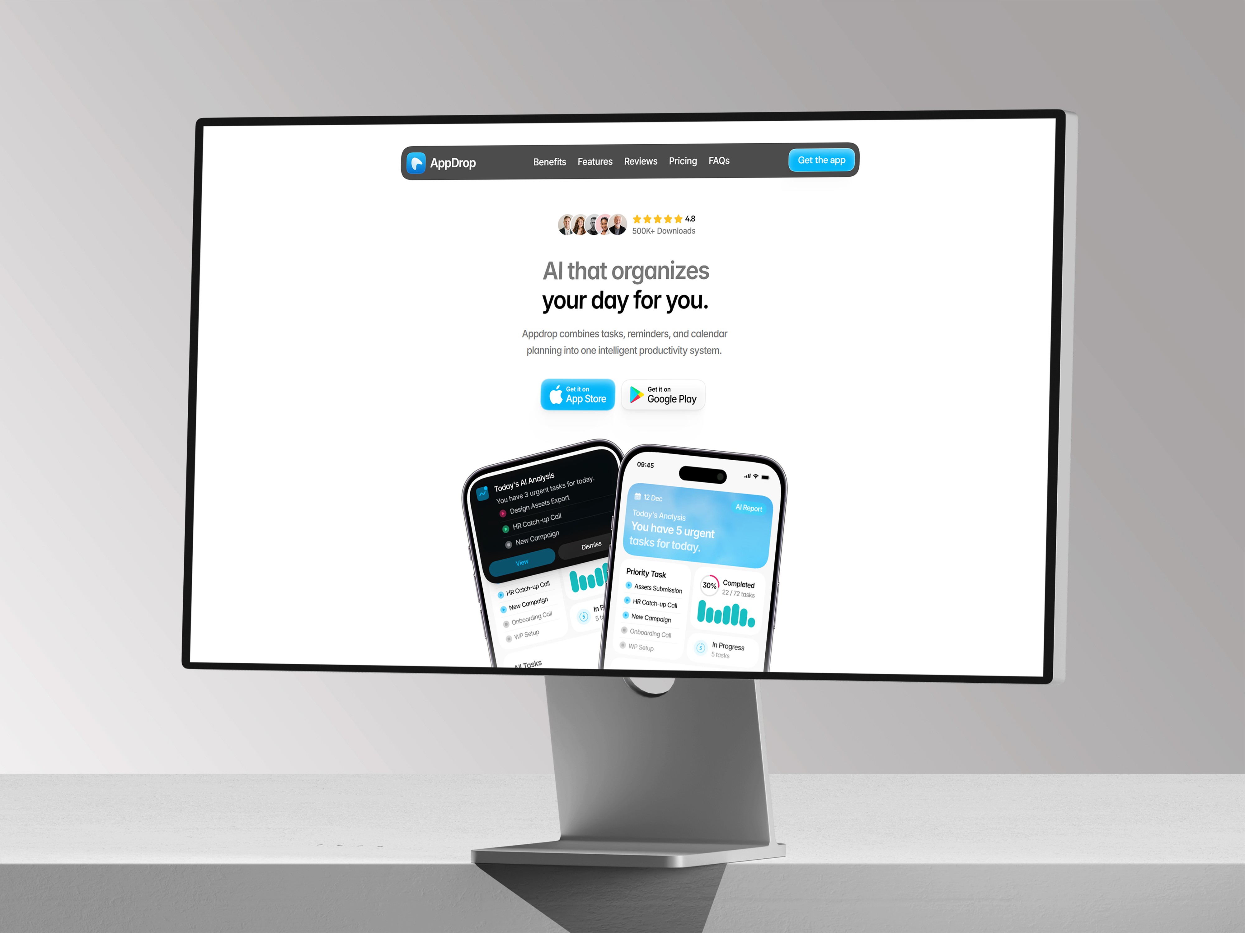
Stop Building Desktop-Only Framer Sections
A practical guide to planning Framer sections so tablet and phone layouts don’t become a last-minute cleanup job.


The mistake: designing only for the wide canvas
A lot of Framer sites look great at 1200 pixels and then slowly fall apart as the screen gets smaller. The usual cause is simple: the section was designed as a desktop composition first, and the smaller breakpoints were treated like cleanup instead of part of the layout system.
The fix is to decide what should stack, wrap, shrink, or stay fixed before the section gets complicated. Build the desktop version with flexible widths, sensible max widths, and containers that can naturally become single-column on tablet and phone.
Do it properly
Use a centered content wrapper, keep text inside flexible columns, avoid narrow fixed text widths, and check the section on tablet before adding decorative details. If a row has more than two meaningful pieces, assume it will need to wrap or stack later.
Quick checklist
Before calling a section finished, ask: does the main content still read in order on phone? Are buttons still tappable? Is any image forcing the page wider than the viewport? If the answer is yes, fix the structure rather than nudging individual layers.