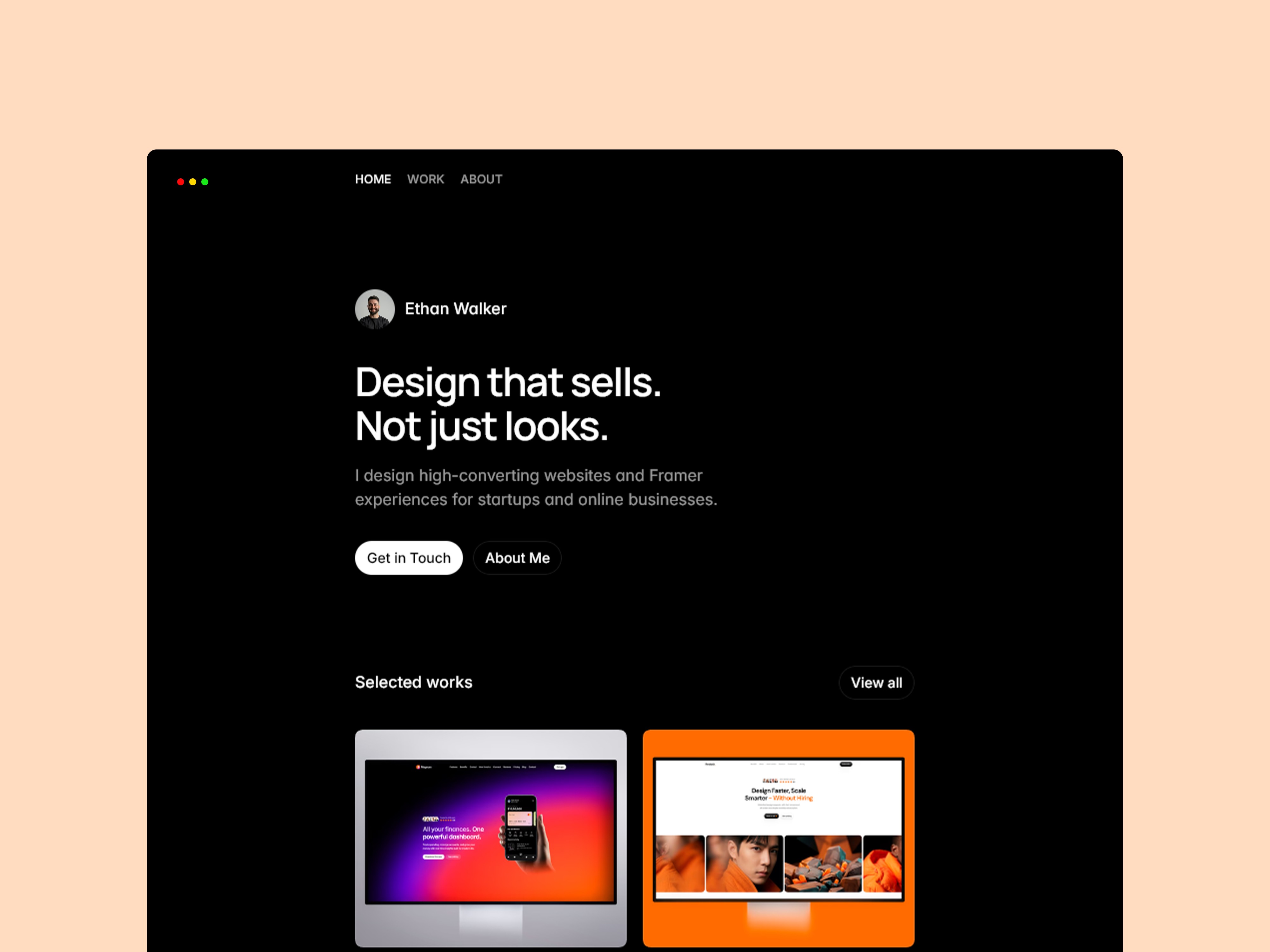
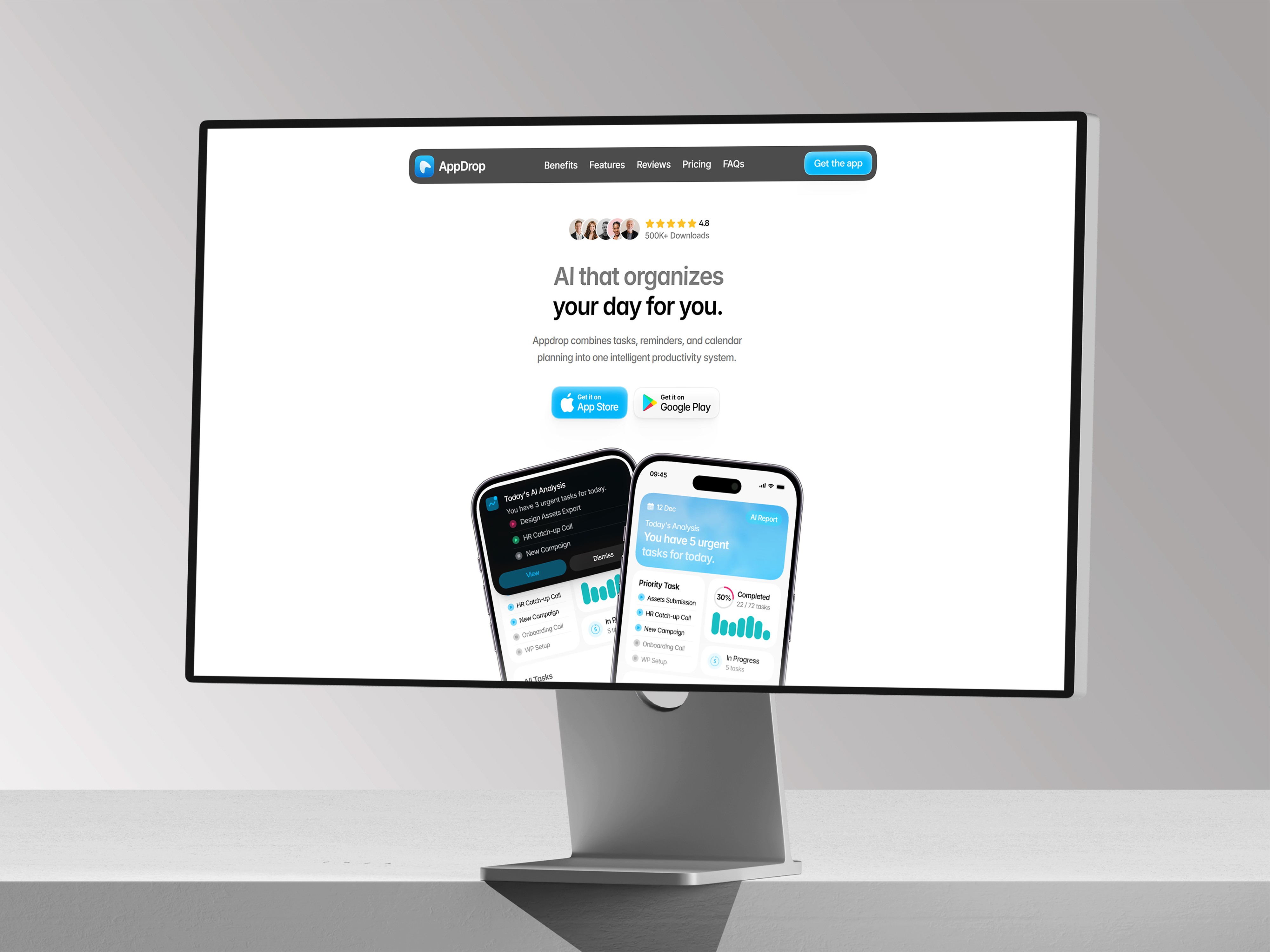
Stop Making Every Button From Scratch
Buttons look simple until a site has twelve slightly different ones. Here’s the cleaner Framer way to handle them.


The mistake: treating buttons as one-off layers
One-off buttons are easy to make and hard to maintain. After a few pages, you end up with slightly different padding, font sizes, hover states, and corner radii. The site starts to feel less polished even if each button looked fine on its own.
Buttons are interface rules. They should be reusable, consistent, and easy to update without hunting through every page.
Do it properly
Use a shared button component for common actions. Give it clear variants for primary, secondary, small, or icon-supported states. Keep the label editable, but keep the spacing and interaction behavior consistent.
A practical test
If two buttons do the same kind of job, they should probably share the same component. If a button truly needs to look different, define why: different importance, different context, or a special interaction.